

The Story
SEU Conference is the annual spiritual conference held by Southeastern University in Lakeland, Florida. Through its ever expanding growth and impact, it has brought in renowned names such as Louie Giglio, Cody Carnes, Erwin McManus, Mosaic MSC, Propaganda, Lisa Bevere, and many others. Each year about 3,000 students and community members descend on Lakeland’s Family Worship Center for a three day immersive and life-changing experience. SEU Conference 2018’s theme was Always Only Jesus, and sought to keep Jesus and the cross at the center of the story.
The Challenge
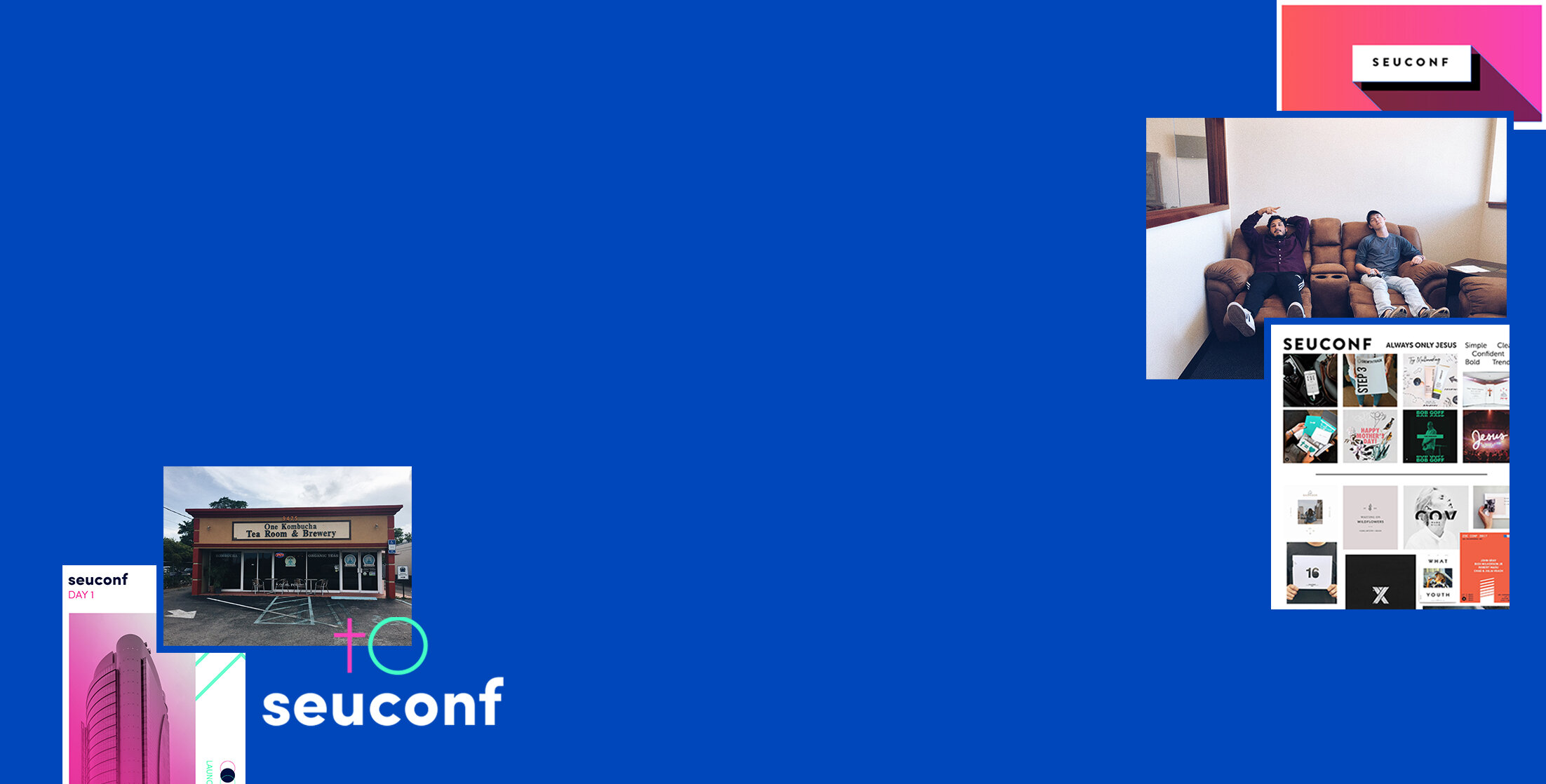
The first three weeks of this project were creative heaven, until the theme changed, and the initial visual direction was completely thrown out (ha). This was met by some frustration and a necessary emergency creative session in a Kombucha shop in West Palm Beach. I went back to my roots, nailed down a moodboard from the client, and plugged away until I had an even better brand than the first idea. The brand had to be versatile enough to be used across a multitude of applications, including merch, stage design, web, social, video, and print. This versatility brought a four-person design team together. The brand needed to be visually strong enough to maintain consistency when applied by each designer, yet conceptually based enough to allow for co-creation by each designer (so that every application did not look exactly the same). While the transient, annual nature of the event lends itself to an overly trendy aesthetic, the transformative, perennial nature of the event required an identity that could be timeless and memorable for the participant.

The Reverie
The simple story of Always only Jesus still needed some sort of narrative arc, so I expanded it to be the movement from emptiness to struggle to realization to emergence to fulfillment. The logo captured this narrative through the emergence of the cross from the black shadow of emptiness and struggle. Upon this emergence from black to white/death to life, the brand moved into a bold, bright, and strong color palette with specific gradients that show the transition from simply being alive to making your life matter. The shadow became the primary visual motif of the conference, being used in numerous places so the brand could be recognized without the logo even being present. The invisible, yet visible emerging cross communicated by the negative space became a secondary visual motif, solidifying the emergence and paving the way for color. The gradients then became the tertiary visual motif, as the experience and brand culminates in the colorful life. Brandon Grotesque, a classic typeface, was chosen to meet the clients desire for cleanliness, boldness, and simplicity, as the theme of Always Only Jesus naturally implies. With these simple yet strong visual elements, the brand was translated into numerous applications...
Role
Art Director
Creative Director
Photo Credits
Loree Rowland